


Take your graphic design skills to the next level with this comprehensive guide on the importance of typography in graphic design.
Typography is an essential element of graphic design that often goes overlooked or is considered secondary to other design elements such as images and colors. It refers to the art and technique of arranging type to make written language legible, readable, and appealing when displayed.
It involves considering the spacing between letters, words, and lines, the contrast between the type and the background, and the overall composition of the text on the page.
In graphic design, typography is used to convey information, express ideas, and create visual interest.
You cannot overstate the role of typography in graphic design. It can impact the overall look, feel, and effectiveness of a design.
Typography can also be used to create hierarchy, convey mood and tone, and add visual interest to a design. By paying attention to typography, designers can create designs that effectively convey their message and engage their audience.
In the following sections, we will explore these aspects of typography in detail.
Legibility In Graphic Design
Legibility is the ease with which a reader can recognize and comprehend written language. In graphic design, legibility is crucial as it affects the readability and overall effectiveness of a design.
In this section, we will explore the role of legibility in graphic design and the factors that affect it, as well as provide tips for improving legibility in your designs.
The Role of Legibility in Graphic Design
Legibility is essential in graphic design as it affects the readability and overall effectiveness of a design.
If the text is difficult to read, you may not effectively communicate the intended message and the audience may become frustrated or disengaged.
Factors Affecting Legibility
There are several factors that affect legibility in graphic design, including typeface, size, line spacing, color, and background.
For example, a small, light-colored typeface on a busy background can make text difficult to read, while a large, bold typeface on a solid, contrasting background can make the text more legible.


Tips for Improving Legibility in Graphic Design
To improve legibility in your designs, consider the following tips:
- Use clear, easy-to-read typefaces
- Choose an appropriate size for your typeface
- Provide adequate line spacing
- Use high contrast between the type and the background
- Test your designs with different audiences to see how legible they are.
By following these tips, you can ensure that your designs are legible and effectively communicate your message to your audience.
Hierarchy in Graphic Design
Hierarchy refers to the arrangement of elements in a design that conveys importance and order. In graphic design, you use hierarchy to guide the audience’s eye to the most essential information first and to create an easy-to-follow visual flow.

In this section, we will explore how you can use typography to create a hierarchy in graphic design and the role of hierarchy in graphic design.
What is Hierarchy in Graphic Design
Hierarchy in graphic design refers to the arrangement of design elements in a way that conveys importance and order. You can achieve hierarchy in graphic design through the use of size, placement, color, and typography.
By creating a hierarchy in a design, the designer can guide the audience’s eye to the most essential information first, making it easier for the audience to understand and retain the message.


How Typography Can Create Hierarchy
Typography plays a crucial role in creating a hierarchy in graphic design.
By using different typefaces, sizes, weights, and styles, designers can emphasize certain pieces of information and make it clear what is most important.
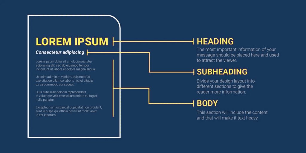
For example, using a large, bold typeface for headings and a smaller, lighter typeface for body text creates a clear hierarchy that makes it easy for the audience to follow the flow of the design.
Examples of Effective Hierarchy in Graphic Design
You can see effective hierarchy in many forms in graphic design, such as posters, brochures, websites, and more.
For example, a poster advertising a concert might have the name of the band in large, bold type, with the date and venue in smaller type below. A brochure for a business might have the company name in a large, distinctive typeface at the top, with sections for different products or services using different typefaces or weights to convey their relative importance.


These are just a few examples of how hierarchy can be created using typography in graphic design.
Conveying Mood and Tone through Typography
In graphic design, you can use typography to convey mood and tone, adding emotional impact to a design and making it more memorable.
In this section, we will explore how you can use typography to create emotional impact and the role of mood and tone in graphic design.
What is Mood and Tone in Graphic Design
Mood and tone refer to the emotional impact of a design. Mood refers to the overall feeling a design conveys, while tone refers to the specific emotion that a design evokes.
For example, a design with a serious mood might evoke feelings of responsibility, while a design with a playful mood might evoke feelings of happiness and fun.
How Typography Can Convey Mood and Tone
Typography plays a crucial role in conveying mood and tone in graphic design.
The typeface, size, weight, spacing, and style of the text can all be used to create a particular mood or tone in a design.
For example, a sans-serif typeface might convey a modern, minimalist mood, while a serif typeface might convey a more traditional or elegant mood.


Examples of Conveying Mood and Tone through Typography
Typography can be used to convey mood and tone in many forms of graphic design, such as posters, advertisements, packaging, and more.
For example, an advertisement for a luxury car might use a sophisticated, elegant typeface to convey a sense of sophistication and luxury, while a poster for a rock concert might use a bold, energetic typeface to convey excitement and energy.


These are just a few examples of how typography can be used to convey mood and tone in graphic design.
Best Practices for Using Typography in Graphic Design
To effectively use typography in graphic design, it is important to consider a few key best practices.
In this section, we will explore some of the most important best practices for using typography in graphic design, including choosing the right typeface, pairing typefaces effectively, using appropriate line spacing and letter spacing, and more.
Choosing the Right Typeface
The first step in using typography effectively in graphic design is choosing the right typeface. The typeface you choose will set the tone for your design and convey the mood and tone you want to convey.
When choosing a typeface, consider the following factors: legibility, style, mood, and tone.
Pairing Typefaces Effectively
Once you have chosen a typeface, it is important to consider how you will pair it with other typefaces.
When pairing typefaces, consider the following factors:
- Contrast
- Compatibility
- Style
Make sure to choose typefaces that complement each other and create a harmonious look and feel.
Using Appropriate Line Spacing and Letter Spacing
Line spacing and letter spacing are also important factors to consider when using typography in graphic design.
Line spacing refers to the amount of space between lines of text, while letter spacing refers to the amount of space between individual letters.
Both of these factors can impact the legibility and readability of your design, so it is important to choose appropriate values.
Incorporating Color into Typography
Color can also be used effectively in typography to create contrast, highlight important information, and convey mood and tone.
When incorporating color into typography, consider the following factors: contrast, legibility, and emotional impact.
Conclusion
In this article, we have explored the importance of typography in graphic design. We discussed the role of legibility, hierarchy, mood, and tone, and best practices for using typography in graphic design.
Typography is a crucial element of graphic design that can greatly impact the effectiveness and impact of a design.
By considering legibility, hierarchy, mood, and tone, and following best practices, designers can create designs that effectively convey their message and engage their audience.
Whether you are a seasoned graphic designer or just starting, taking the time to understand the importance of typography in graphic design can greatly enhance your design skills and help you create designs that truly stand out.
So if you’re looking to take your graphic design skills to the next level, be sure to consider the role of typography in your designs.