Logo designing tips and tactics that help you create the perfect logo that positively impacts how your target audience sees your brand.
The logo design is a task that often does not get the attention it should. While it is true that in practice, the design of a logo can be easy, the results you get with it will not be good if you do not invest the time necessary to devise it properly.
Being able to create a memorable logo that will overcome the time barrier is a task that very few can do successfully. Remember that the logo is the image that your brand has before the public.
If we do not give it the necessary importance, we can create a negative image or contrary to what we want. To avoid this, it is crucial to do a proper analysis before starting the logo design.
If you really want your company logo to make a good impression, it is necessary to understand a series of basic concepts accompanying the design. This article will expose some of these points, which will help you design a good logo.
1. Be Simple

Always try to maintain a standard that is handled with simple strokes. It is not necessary to exaggerate and overload the logo with different styles.
Remember that less is more. If we use several types of typography or too detailed strokes in the illustrations, we may complicate everything and get an unattractive logo.
A simple logo will always be easier to memorize than an overly elaborate logo, the more complex we make a logo, the more difficult it will be for the user to relate it to a brand. A simple design does not even need to include the name of the brand.
It can be an icon, a letter, or initials. This facilitates the association of elements in people.
2. Be Creative
When designing a logo, there is nothing better than being CREATIVE. Suppose we maintain a static attitude where we always want to create using the same pattern and the same elements.
In that case, we may be able to get ahead in a couple of projects, but our work will stagnate in the future, and our logos will start to look unappealing. For a design to survive, it must be malleable.
To be able to stay in the minds of customers, we must use dynamism in our logos. Remember that our users will be people from different parts of the world with varying walks of life and forms of education, so our logo must have the capacity for flexibility.
3. Stay Versatile

When designing a logo, it is vital to keep versatility in mind since it allows us to create styles and effects that do not require subsequent changes to adapt to the client’s needs. The logo you design must be able to be used almost anywhere.
Remember that companies will not only use it on their website, they will also print advertising, business cards, and official stationery. That is why your logo must be able to adapt to the medium.
That is where versatility comes into play. It is essential to consider the appearance of the logo in different sizes and colors.
Remember that companies carry out campaigns on many occasions where they decide to use some other range of colors, such as a Christmas promotion where red predominates. It is also essential that your logo can be used on clothing, uniforms, and shirts without any problem.
4. Be Original

Being inspired by the work of others is inevitable, but you can always seek to add elements of authenticity that set a specific guideline so that our logos are different and can even be considered as design models.
When trying to follow trends, we can fall into a pothole of originality. To avoid this, it is crucial that we maintain our essence and that our work remains unique.
Thinking outside the box will allow us to arrive at an unusual design, demonstrating our creative capacity and defining how we like to work. Using our own techniques, in the long run, will allow us to do our work more easily.
5. Take Care of The Colors
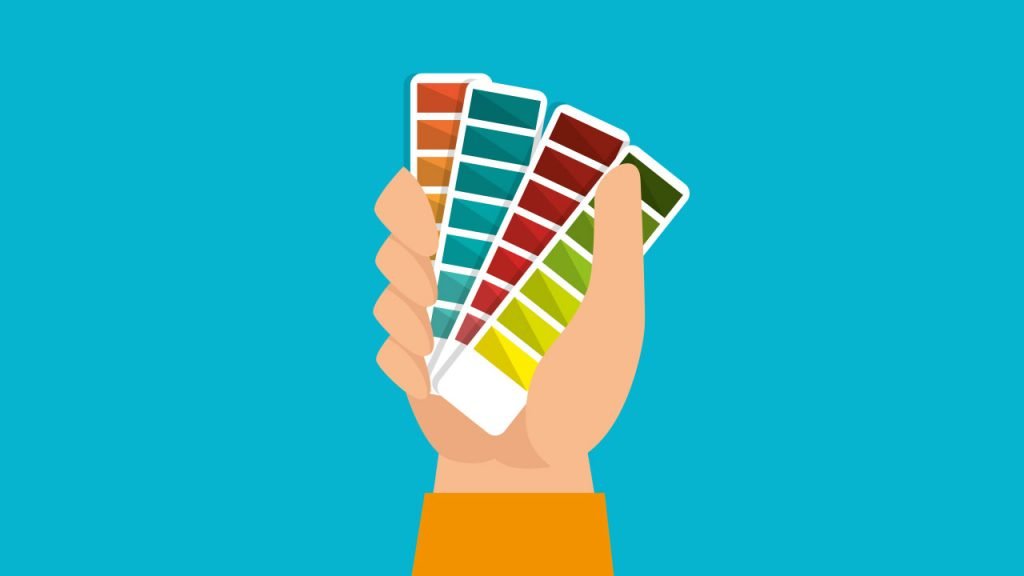
Ignoring the color palette and using colors that don’t match just on a whim can lead to low-quality logos. The importance of colors should never be underestimated.
To arrive at a suitable color palette for our logo, we must know very well the type of product that the company or the client who made the request handles. For example, if you are making the logo for a youth campaign, it is recommended to use vibrant colors that inspire action.
On the other hand, if the logo is for older adults, you should look for the use of colors that inspire serenity.
6. Avoid Cliches And Predictability

Many companies are identified by a certain specific product or by a play on words. We must avoid falling into the predictable, always offering a logo that inspires something new or better than what people already expect from that brand.
In addition to this, we must avoid falling into clichés. Remember that clients are increasingly aware and soaked in the world of design, so if we fall into a cliché, the logo can be boring and without any proposal.
It’s pretty unpleasant to see the same logo over and over with just a few tweaks or changes.
Conclusion
Learning how to create a good logo from scratch is hard enough, but with the help of these logo design guides, you will never need to think about how to create a perfect logo design again.
Follow these logo-making tips, and let us know in the comments below when you’ve created the perfect logo for your needs and the tools you used.
We would love to hear from you.
Even a super attractive logo doesn’t have meaning right away — it’s something that’ll grow stronger and more impactful as you gain the respect of users and customers over time.
That is absolutely correct.