
8 essential tips to design the perfect logo for your brand. Learn how to combine creativity with strategy to make a lasting impression.
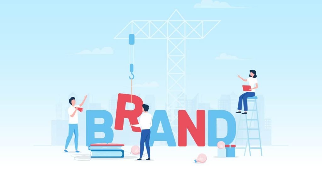
Have you ever seen a successful brand without an eye-catching logo? I’ll save you your time, there aren’t any. If you want such a logo, there are specific design tactics you need to know.
Tactics that help you create the perfect logo that positively impacts how your target audience sees your brand. A logo that engages your customer’s emotions conveys your brand’s personality and individualism and ensures you stand out from the crowd.
The truth is, your logo carries a heavy burden, and as a business owner, the responsibility to create the perfect logo lies with you! But there’s no need to panic; we’ll help you create the perfect logo with our proven pro design tips.
1. Define Your Brand Identity And Write Your Story
We love great stories no matter how they’re told because they grip our imagination, touch our souls, and allow us to dream, often staying with us forever. Your logo needs such a story.
And, it’s a logo creator’s job to ensure the story told elicits the correct emotional response from your target audience.
However, you must first know your story and fill it with your brand’s personality, UVP (unique value proposition), and goals. Only then can you choose specific design elements that help tell your story, keeping your audience hooked from page one.
Questions to help you find your story:
- Why did you start your business?
- What beliefs and values are important to you?
- What makes you unique?
- Who are you trying to help?
- How are you helping them?
- How are you better than the competition?
- Which adjectives would you choose to describe your brand?
You don’t have to be J.R.R Tolkien or J. K. Rowling to tell your brand’s story through your logo; this isn’t make-belief; it’s who you are, your reason for going into business, it’s your story.
2. How To Find Inspiration For Your Design

Finding inspiration can be one of the most challenging stages of designing a logo. But thankfully, inspiration can come from anywhere.
For instance, J.K Rowling conjured up the idea for Harry Potter while delayed on a train! And J.R.R. Tolkien by his profession (philology) and his love for languages.
What about us mere mortals though, how do we get our creative juices flowing? Fortunately, some websites can help you find inspiration, such as Behance and Dribble (or social media platforms like Pinterest and Instagram).
But you can also find inspiration by looking around you; what colors, shapes, and fonts attract you? Most likely, they’re hanging on your walls or sitting on a sideboard.
How To Use The Inspirational Elements You’ve Found
Once you have a collection of different colors, shapes, fonts, and images, it’s time to bring them together using a strategy called brainstorming.
Brainstorming is a commonly used strategy that helps you create while keeping your ideas in line with your story and brand values.
- Follow the brainstorming rules: Brainstorming is about projecting your ideas (good and bad). Because every thought you have has merit, and often, what we believe to be bad at first sparks an inspirational idea that leads to a genius solution.
- Become your audience: Use those three adjectives that describe your brand; now add three more words that describe how you want your audience to perceive you. Approach this from your audience’s perspective; what are their needs and pain points?
- Involve everyone: Magic often happens when the right minds come together. Bring as many people together as possible, note all opinions, and let others help you create the perfect logo.
3. Great Stories Are Often Copied!

A quick way of finding design elements that work for your marketplace is to check out the competition, steal (or borrow) their ideas, and use them to design a unique logo of your own or hire a freelancer to do it for you.
Start by looking at the top 10 brands on Google and those with popular social media accounts. It’s usually the brands with the largest audiences that have consistent branding that’s niche and audience-related, especially their logos.
Take note of what makes them different from the less established brands, then try these design tactics out in your logo. But while taking design inspiration, also try alternative approaches to ensure you stand out from the crowd.
For example, if your competitors use mostly traditional design styles, you could retain features such as color but adopt a more modern approach.
4. Pick Your Style And Wear It Well
Once you’ve found inspiration and outlined your story, it’s time to choose a style and infuse it throughout your preferred design elements, such as colors, typography, shapes, and icons.
By first isolating each selected component and establishing what it brings to your logo, you’ll simplify the process and, most importantly, your logo’s design.
Just as particular flowers attract certain bees, the style you choose says a lot about your brand’s personality and plays a huge part in attracting your target audience.
And remember, no one style suits all, so don’t try to please everyone when choosing yours. Instead, be true to your brand’s personality and design with your niche audience in mind.
Some styles to try on:
- Classic
- Retro or vintage
- Modern and minimalist
- Fun and quirky
- Handmade and handcrafted
5. Which Logotype Suits Your Brand?
Your next step is to choose a logotype that suits your style and is usable for all your marketing strategies. However, deciding on a logotype can be tricky because there are nine different types to choose from, and your logo has to be super versatile to succeed.
But don’t worry, as all nine types of logos can be reduced to three categories:
- Image-based logos
- Text-based logos
- Combination marks
Your niche, business name, style, and design preferences often influence which kind of logotype you choose. However, combination marks are an excellent choice for new businesses as they convey the most information, and they’re versatile.
Their versatility comes from the ability to break them down into three parts.
The combination, contains an icon and your name/slogan (perfect for your website), a word signature (ideal for print advertising), and an icon logo (ideal as a social avatar and email signature).
6. Time To Experiment With Typography
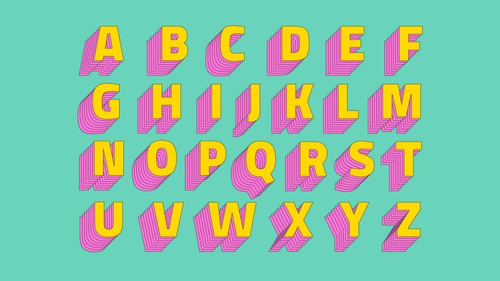
Before you start scrolling through the thousands of available fonts, it helps if you know what you want to say.
This is where the style you’ve picked and your target audience come into play because every niche has a particular way of talking, and your fonts connect when they speak the same language.
An excellent place to start your search is to look at the three basic font types, Serif, Sans Serif, and Script fonts.
- Serif fonts: Serif fonts give a classic and high-end look to a logo. Serifs are the “feet” at the end of each letter. They’re incredibly versatile and work well with numerous designs, especially vintage, classic, or elegant designs.
- Sans-serif fonts: Sans-serif fonts are perfect for a modern, clean-looking logo. Void of the Serif “feet,” they look sleek, clean, and straightforward.
- Script fonts: Script fonts look handwritten and are great for giving your logo an individualistic look and feel. You can use them with all font styles, such as elegant calligraphic to down-to-earth scripts.
7. Color Is Crucial For A Great Logo Design!
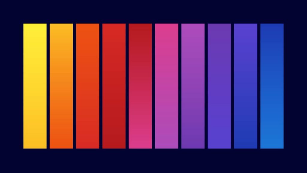
Color provides a variety of cool tricks to your logo. It can make it pop from the page, grab the viewers’ attention, influence how we feel and think, and even make us take specific actions.
But to use color effectively, you need to first understand the psychology of color so you can choose ones that suit your niche, target audience, and the message you want to convey.
Let’s break each one down:
- Your niche – Each niche has traditional colors associated with it (blue for banks and insurance, white for wellness, and orange for fitness). You can find yours by looking at your competition.
- Your audience – Audiences expect to see certain colors used for specific businesses, ones that match the service or products. If you choose ones that aren’t associated with your service, you’ll confuse the viewer and fail to connect.
- Your message – Significant studies show the value of color and the effect it has on us. Color psychology is potent in marketing, as specific colors create certain reactions.
Top Tip – Try The Visual Salience Technique
Color, of course, catches the eye, and there’s a design technique called “visual salience” that works every time. Visual salience can make your logo ‘pop’ from the page by adding one intense color to either a symbol, the first letter of your name, or to one half of your script.
Adding a tiny pop of color is a simple approach with powerful results; Amazon’s use of orange in its logo is an excellent example of this technique at work.
8. Imagine Your Logo In Situ
Just because your logo looks great on paper doesn’t mean it’ll work on all your marketing materials. So, before you press print, it’s a good idea to put your logo everywhere you’ll be using it, so you know for sure it has the versatility required.
Fortunately, you can do precisely that by using an online logo-making tool. These tools enable you to see your logo in multiple formats and on numerous merchandise, such as bags, cups, caps, and of course, on your website.
If, however, you’re using a designer, ask him to provide an example of your logo in situ before you purchase.
Also Read:
- 4 Steps To Become A Web Designer From Scratch
- 400+ Vector Illustrations To Supercharge Your Design Projects
- 6 Tips For Designing A Good Logo For Your Brand